Strange times, and we all have different ways of coping with the strangeness. For several weeks now, I’ve been taking a closer look at the Texas infection data. Since the beginning, I’ve been putting up the John Hopkins dashboard on my secondary display, updated hourly automatically during my awake hours to keep myself from refreshing the screen too often.
I use this cron line on my Mac (all one line):
0 8-20 * * * open https://www.arcgis.com/apps/opsdashboard/index.html#/bda7594740fd40299423467b48e9ecf6
For those that don’t know the command line and cron this means “at the top of the hour between 8am and 8pm open this url with the default browser”
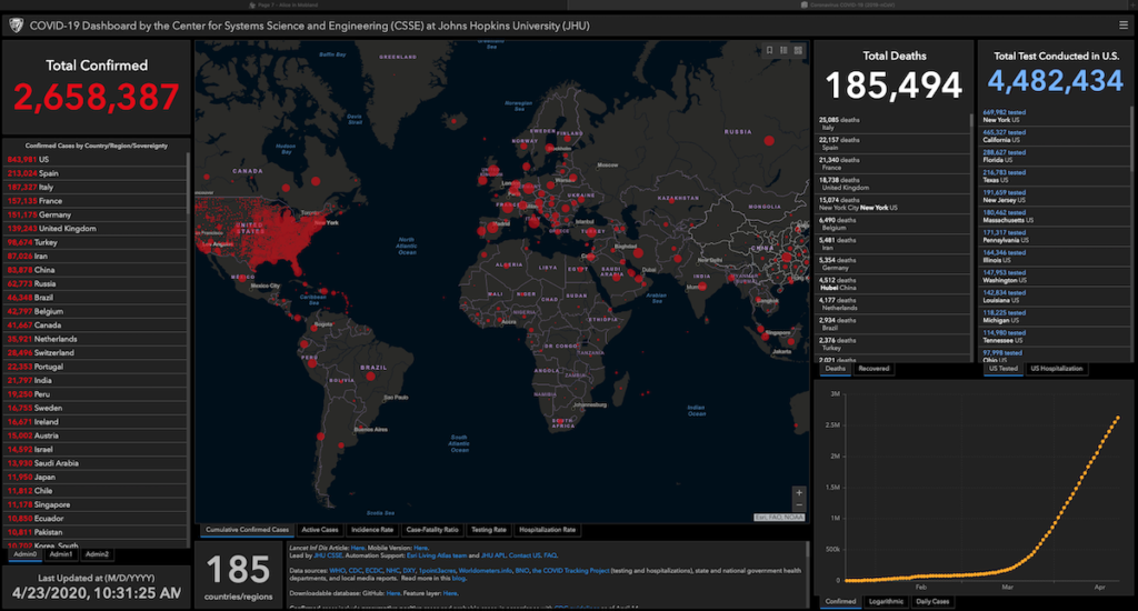
But just clicking around on the interactive dashboard didn’t give me the information I wanted, so I dug deeper. On the dashboard, it had a link to the downloadable database that drove their chart.
There are various data files, basically CSV files that any spreadsheet can read, there for the taking.
So, I wrote the following program to pull what I wanted and filter it down to Texas data only. In this blog, those if statements are all one line.
#!/bin/zsh
base=$HOME/COVID-DATA
mkdir $base 2> /dev/null
find $base -ctime +4h -delete
target=time_series_covid19_confirmed_US.csv
if [[ ! -e $base/$target ]] ; then curl -o $base/$target https://raw.githubusercontent.com/CSSEGISandData/COVID-19/master/csse_covid_19_data/csse_covid_19_time_series/$target ; else echo “exists”; fi
echo “Dates,14,,,,,,,21,,,,,,,28,,,,April,,,,,,7,,,,,,,14,,,,,,,21″>$base/Texas_confirmed.csv
grep “,Texas,US,” <$base/$target |cut -d , -f 6,66- >> $base/Texas_confirmed.csv
target=time_series_covid19_deaths_US.csv
if [[ ! -e $base/$target ]] ; then curl -o $base/$target https://raw.githubusercontent.com/CSSEGISandData/COVID-19/master/csse_covid_19_data/csse_covid_19_time_series/$target ; else echo “exists”; fi
echo “Dates,14,,,,,,,21,,,,,,,28,,,,April,,,,,,7,,,,,,,14,,,,,,,21″>$base/Texas_deaths.csv
grep “,Texas,US,” <$base/$target |cut -d , -f 6,67- >> $base/Texas_deaths.csv
And I ran this program at 9pm everyday also using cron:
0 21 * * * /Users/hmelton/bin/covid
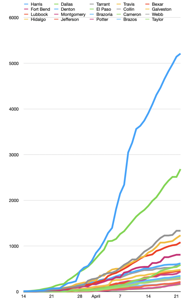
And now I had data I could work with with my spreadsheet. Every morning, I open up the COVID-DATA folder on my desktop and up pops a spread sheet with every county in Texas from March 14 to the current day, in alphabetical order. I sort the counties by the last column, with the current infections (or deaths in the case of the Texas_deaths spreadsheet) and them make my charts for the day.
My first chart plots the growth of the infection in the top twenty counties. This morning I noticed that Williamson County, where I live, had dropped out of the top twenty. That means that other, more rural counties are getting more infections.
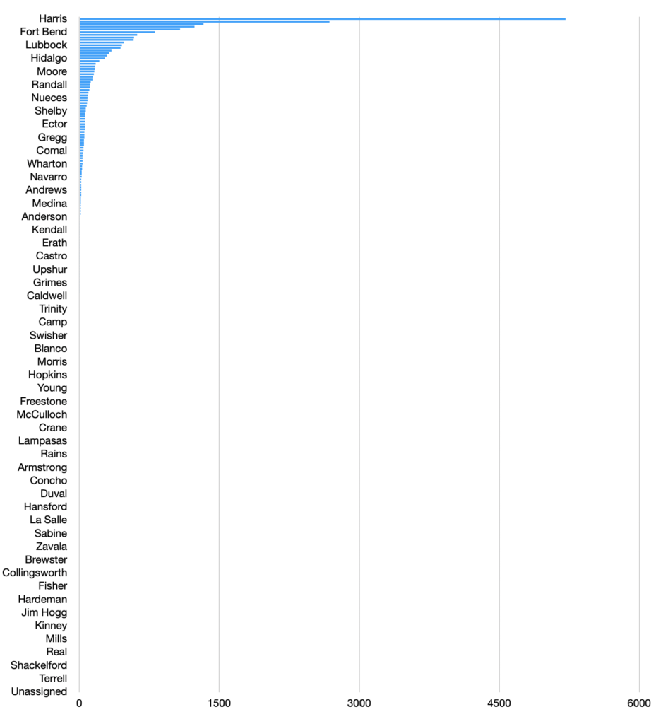
That prompted me to make a stacked bar chart of how the counties compare.
In general, I vary which charts I make each day, depending on what I’m interested in. I don’t keep them, since I can always re-create them if necessary. I’m sure there are more elegant tools than some shell scripts and cron to get what I need, but those work, and since it’s just for my own eyes, those old tools are good enough.