Spring has come, and it’s time for another book catalog for Wire Rim Books.

Last year, I did my fall and spring catalogs with the Pages software from Apple. It’s part of the iWork software suite. While some have referred to Pages as a word-processor program, I’ve always thought of it as a page layout program. You start from a template and drag out your text boxes. Using it was relatively easy, and I had no difficulty producing those first two catalogs. They were essentially a flyer, front and back of a single sheet, which I could fold in half like a booklet. The first only had two titles and the second had four, so I really had no difficulty getting everything to fit. By nature, I’m not a template user, so I had started from a blank sheet. I did look at all of Apple’s suggestions, but none of them worked for me.
When I started on the Spring 2009 catalog, I first reached for the previous catalog with the intent of just adding the additional title. Two things stopped me. First was that with five books, I was running out of room for a single sheet catalog. They wouldn’t all fit, not without shrinking the postage stamp sized book covers down even more and giving each fewer words to go with it. Second, I had come to the conclusion that each book needed its own page. With five pages for the books, one for series and author info, the front page splash and the last page for contact and ordering information, that meant eight pages, double the size. I wouldn’t be able to re-use much of the previous version at all. Plus, more books are in the planning stages, I really needing a design that could grow easily. Again, I looked at the Pages templates. Nothing really matched what I wanted.
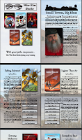
Spending so much time in InDesign for my book layout projects, I was inclined to see how well it would do with this kind of task. Once I started, by creating my blank, 8-page document, I began to see that I had quite a few more options than I had with Pages. I did the splash page, and then experimented with putting photos I had taken during my book research down as transparent back drops to the text. I put a small down main-street image behind the information about my Small Towns, Big Ideas series. I put the Mackinac Bridge behind the page where the novel Lighter Than Air was featured, and so on. It looked nice to me, and maybe it would get across to somebody the idea that those stories were rooted in the real world.
Everything was going smoothly, until I added the little tables with the ISBN numbers and the prices, etc. The first one worked, and then I tried copy and paste to duplicate the table to the other pages. Evil magic happened. It wouldn’t work. I tried and tried, using different techniques and spending quite a bit of time on the Adobe forums looking for hints. After a day or so spinning my wheels, I came to the conclusion that I had garbaged up the layout with too many accidental text blocks. It’s far too easy to lay down multiple identical invisible text blocks in the same place. Plus, I’d made the mistake of, coming from my book layout experience, of having all the pages as one ‘story’, all linked together. Bad starting design had messed me up.
So I started over, clean. I kept the same design ideas, but each page was now independent, and wonder of wonders, I could copy and paste the tables with no problem. I turned my efforts back to laying out the covers and the blurb text and even had space for clips of good reviews to fill up each page (too many good reviews, luckily). In very little time, comparatively, I had my finished 8-pager and uploaded the PDF to my catalog page. A trip to Kinkos and I’ll have a stack for mail-out use.
You can see the results. Visit my Catalog download page here.
Pages vs InDesign? I’ll keep Pages for one-page flyers and quick turn-around uses. It is very easy to use. But for bigger projects, I’ll go with InDesign. There’s a learning curve, but it is a very powerful tool that I am more comfortable with day by day.
Whatever you’re doing, it looks spiffy, Henry.
Professional web psdtemplates,flash templates easy to download at itemplatez.com .
Same here. Pages for small projects, ID CS5 for big ones.